Tabular and Graphical Evaluation
Tabular Evaluation
This is the display of all hourly values in the form of a chart. It is possible to select the series of data by clicking on the title, copying with “Ctrl-c” and inserting it in Excel. This visualization is possible at the Designer level.
Graphical Evaluation
The graphic tool of Polysun (Professional and Designer level) offers the possibility of having a visual analysis of the data. The following values can be represented, on the basis of hourly values, for any period of time (year, month, hour and intermediate periods):
- All temperatures
- All power values
- All flow rates
- All on-off statuses
- All Sfg solar fractions
The temporal scale can be freely selected by opening a box using the mouse. If it is necessary to display more than one scale (for example one for temperature and one for power value), these are visualized to the left and to the right of the graphic chart and one or the other can be dragged vertically and independently. If in addition you add one of the values without units “solar fraction” or “pump activity”, the temperature is spread from 0 – 100 and the corresponding value is represented in %.
The consumption values, such as hot water consumption, the heating energy demand and the night cool-off temperature are indicated with a negative sign.
Suggestions: The results are of average hourly values and might not be precisely represented over the course of an entire year. A year contains 8760 hours, a screen has many fewer pixels. Therefore in the visualization of the year the values become averages over more hours. This creates confusion above all regarding the temperature of the collector. Consequently a time frame as brief as possible is to be selected.
The values that change in the course of an hour are equally difficult to interpret. If the pump is activated for five minutes, the status will be indicated in the entire hour as 1, that is, “on”. The effective operation time of the pump can only be evident in the visualization of the component results.
For an even more detailed analysis the user can switch between the graphical representation of the hourly values and the time-step values. Hourly values could not be precise enough for system evaluation purposes. Therefore, it was made possible to change to more detailed time-step-based graphical representation by clicking on the button “Show details”.
You can also zoom-in and zoom-out by choosing the certain area on the graphic with a pointer.
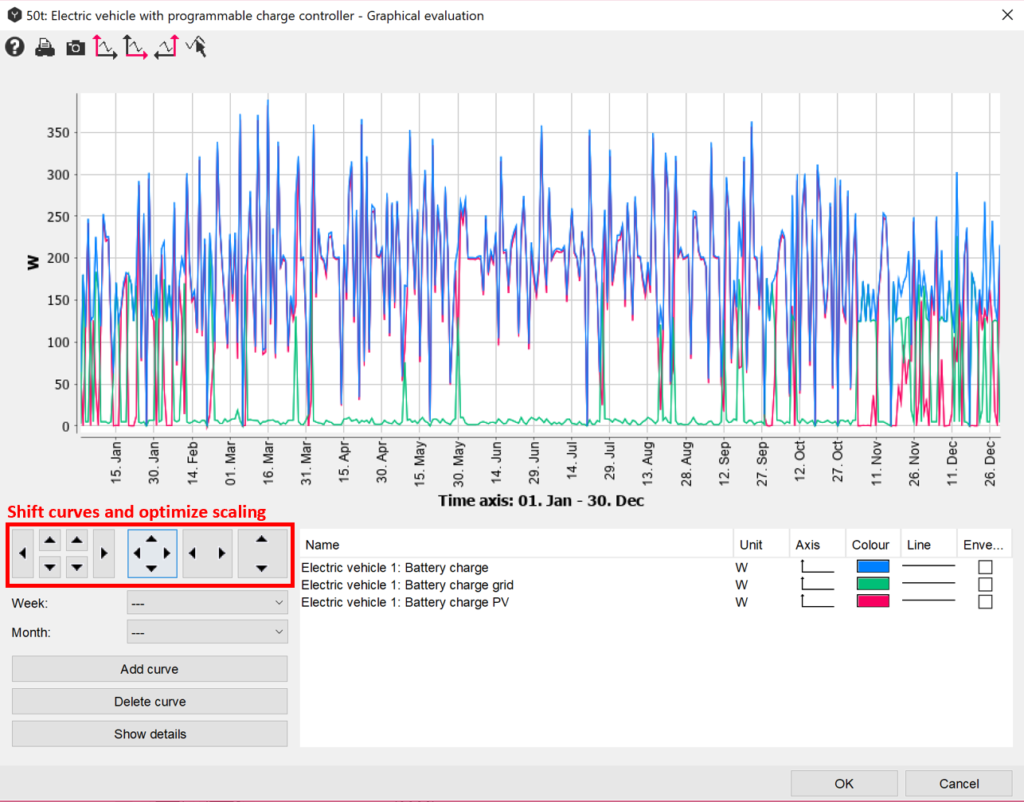
By clicking on the buttons marked on the above-shown figure the user will be able to shift curves and optimize the scaling. Tip: the scaling can be vertically improved if curves run over the lower edge of the graph.
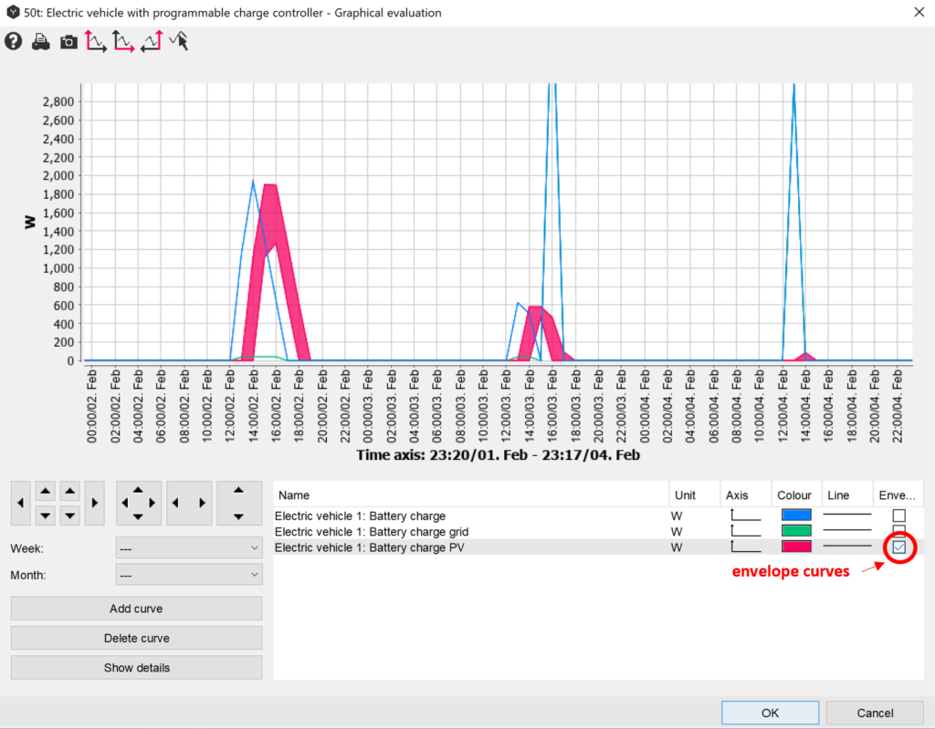
In order to see the minimum and maximum values of the certain parameter, the envelope curves can be ticked. This function can be applied only to hourly values.